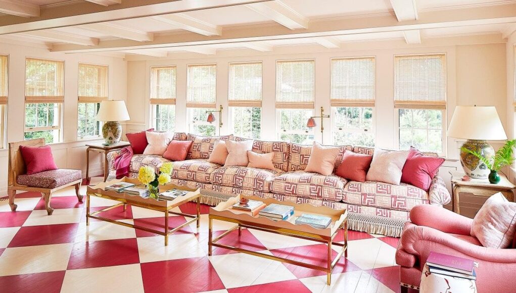
Aesthetes have been thinking pink for ages. We know, for certain, that an interest in this color dates at least to the 18th century, when Madame de Pompadour requested her own rosy shade by French porcelainiers; a century later, Sawai Ram Singh II painted Jaipur pink to honor HRH Albert Edward, Prince of Wales. From the shocking pink of Schiaparelli to the reclaimed pride of Gran Fury’s pink triangle and the Time’s Up pussy hat, the bright Bougainvillea of Miami’s ’80’s cocaine chic, to the endless rosy scroll of millennial pink, the hue is here to stay.
But how to make it fresh? Joa Studholme, color curator at Farrow & Ball, says that mainstay tones like her brand’s Setting Plaster and Pink Ground, are timeless, “because they feel like they’re giving you a big embrace.” And who, in these still-socially-distanced times, wouldn’t want that? Steven Johanknecht, of Commune Design, likes the latter so much, he specified it for Goop’s New York store. “Its warm, dusty pink with hints of yellow was the perfect color to capture the Hollywood glamour of the 1930s,” he says.
Looking for more? Here are nine more industry leaders with ways to think pink.
Eve Ashcraft
My favorite pink is one that I made for Domingue Architectural Finishes, called Primrose. It’s pale and pretty and it’s beautiful on ceilings. I also love it as a backdrop for dark wood furniture because it creates a yin-yang balance. I’ve used it as lime wash and it’s ethereal.
Kelly Behun
Donald Kaufman’s Uccello Pink, inspired by the faded egg tempera paint on a 15th-century triptych by Florentine painter Paolo Uccello, is as rich and sophisticated a shade as you’d expect with a backstory like that.
Andre Herrero, Charlap Hyman & Herrero
We used Fairest Pink by Benjamin Moore in a project we did for Moda Operandi. We fell in love with this color because it is both sophisticated, playful, and warm—without being too poppy.
Mandy Cheng
I do love Portola Paint’s Potter’s Clay in their limewash finish, which is the color I’ve used to paint my office. It’s a beautifully warm and bright nod to terra-cotta pots, and is sophisticated enough to use in any room.
Jenny French, French 2D
Though we’re fond of working with magentas and hot pinks in textiles and installation work, we love Benjamin Moore’s subtly subversive Nautilus Shell 064 as the main exterior body color of the soon-to-completed cohousing project we’ve been working on. The peachy hue of this neutral hits many marks, playing well with the Victorian “painted ladies” nearby, and establishing a base tone for a range of soft and bright counterpoints and characters.
Christine Gachot
My classic go-to neutral has been camel for years, but recently I’ve been feeling pink. Lighter, dustier versions such as Farrow & Ball’s Peignoir can convey a similar sense of inviting, urbane sophistication that trusty camel always did for me, but with a bit more fun. Pair with a rich burgundy or dark navy for compelling contrast. The inspiration came to me primarily via a bag I have my eyes on for spring—while I wait for that, my clients will see the same color applied to their walls!
Corey Damen Jenkins
One of my favorite blush hues is Pink Swirl by Benjamin Moore. I used it extensively in my Kips Bay Decorator Show House “Ladies Library” [in 2019], and the walls in that room looked as if they were dripping with champagne. The right shade of pink on walls (and even the liner of lamp shades) can make people glow like Hollywood movie stars!
David Rockwell
For Casa Dani at Manhattan West, we really wanted the color palette to evoke the feeling of a traditional, open-air, Spanish courtyard. For the undulating ceiling, we used a custom terra-cotta blush limewash finish. There is something about that color that seems to capture the way the Andalusian setting sun plays off all the Mediterranean-style roofs. Casabella, a warm and light terra-cotta hue from Benjamin Moore, transports me to Spain in much the same way.
Emily Ward
Our favorite shade of pink is Foxy Brown by Benjamin Moore. We love it because it’s a tried and true classic that feels both masculine and feminine. It also looks amazing in any light!


