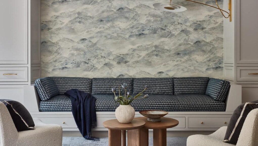
Giorgio Armani was called the king of it. Goethe’s Theory of Colours replaced white with it as the synthesis of all hues, roughly. Kim Kardashian made a career out of it, and Sherwin-Williams, an empire, as subtle variations of the color consistently fill the paint company’s top 50 sellers. Greige is a feeling: Humming with industrial chic while purring with warm undertones—or, if you’d rather, putting us all to sleep with its ever-present, insistent blah. But after decades of dominance over interior design, the time to stay neutral on this most neutral of hues is over. AD PRO asked top design talents and color experts to pick a side. Greige: yay or nay?
❌ A Non-Neutral No
“I happen to love greige,” says New York–based shade specialist Eve Ashcraft. “But when colors become trendy the risk is that they’ll be used on everything. I’m super burned out on it right now because it’s been abused. There’s a trickle-down effect, where some chic room goes viral and, two years later, half the world looks like the HGTV or HomeGoods version.” Designer Danielle Colding concurs: It’s time to take a break. “Greige in and of itself is fine. However—and there’s a big however—it’s all in the mix,” Colding says. “Greige on greige on greige feels lifeless and tired. We can afford to let go of safe showroom greige. Go big or go home.”
😐 Take It or Leave It
Despite its dull reputation, greige can throw other design elements into relief, some designers say. “You have to proceed with caution,” warns AD100 designer Young Huh. “[The color] requires a photographer’s eye, knowing how to play with the light and negative space. Architecture makes a big impact. You have to think sculpturally.” Future Simple Studio principal Christine Djerrahian agrees. “Given our total soft spot for Brutalism and concrete, we are big fans of greige. That said, it has to be used with interesting objects, unexpected materials, and strong proportions. Otherwise, the space may end up feeling unremarkable,” the Montreal-based architect says.
For better or worse, greige can be a snooze. “I find it’s a bit of a sleepy color when taupes and beiges and browns are layered on top of each other,” says Portland, Oregon–based designer Jessica Helgerson. “But as a backdrop for those other colors, I find it calming and beautiful.” In Chicago, designer Elizabeth Krueger is up for the challenge. “I’m not someone who finds greige blah—when it’s done right,” she explains. “But often designing with restraint is harder than it looks!”
✅ Go for the Greige
“Greige rules!” says Brooklyn-based AD100 designer Leyden Lewis. “It toes the line between warm and cool, whereas white can be quite stark. And unlike white, greige can have variations in texture and color, giving it a lot more character than people might think.” Fellow Big Apple–based designer Adam Charlap Hyman likes its slippery character. “It manages to read as gray while containing the warmth of beige,” says the AD100 principal of architecture and design at firm Charlap Hyman & Herrero. “It’s great in New York in particular because it looks so good under natural light, and lots of interiors there rely on that.” His own living room—painted in Benjamin Moore’s Classic Gray 1548—included.
It works in sunny climes too: Architect Artur Sharf of YoDezeen has clad projects from Miami to Dubai in greige. “We love balancing light-infused bases with a tasteful allocation of 15 to 20% of our beloved hue,” he says. Meanwhile, surprisingly, Ken Fulk is all in. “I’m someone who adores color, the bolder the better,” says the New York designer known for his vibrant interiors. “Greige is the perfect counterpoint for bold colors to shine. Nothing is chicer than lipstick red against a Dior gray canvas or acid-green-lacquer trim popping off the depth of warm gray walls.” Like a good dinner party, it’s all about the guest mix. “The contrast is what provides the tension and makes for a beautiful combination,” Fulk continues. “We all need a sidekick in life, and in the design world, greige is the ideal companion!”


