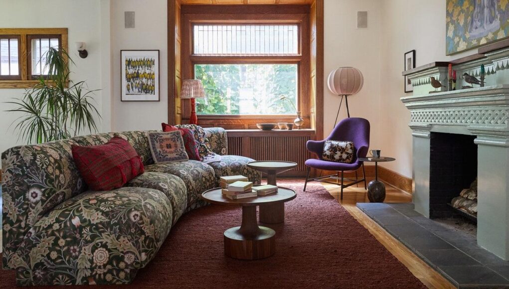
Whether wrapped in brown grocery paper or the centerpiece of a Van Gogh still life, flower arrangements have always had a place in our homes, our museums, and our history. According to Victoria Sass of Prospect Refuge Studio, floral imagery as it relates to design is as dated as the domesticity of humans—it’s “tiled into the floors at Pompeii, painted onto ancient Egyptian ceramics, [and] woven into Renaissance tapestries,” she explains.
Like most aspects of Western existence, floral motifs as we see them today, stem from colonization, as perpetuated by design theorist Owen Jones and his 1856 book, Grammar of Ornament. As design enthusiast and @rub.ish.nyc founder Carlo V. explains, “He’s considered the first ‘interior’ designer, but [is] highly problematic given [that] he basically stole ‘exotic’ patterns from the global South and organized them for white Western consumption.” His sourcebook amalgamates the tiles and ceramics cited by Victoria alongside other cultural floral prints, like Indian batiks and woodblock painted calico.
The all-too-familiar marriage of appropriation and mass production eventually found its way to the U.S. and made its mark on the design world. Perhaps what is most interesting about floral prints is how, in their American induction, they came to have such distinct styles across decades. One reason being political influence, says AD100 designer Joy Moyler; and, like politics, society’s opinions on what we needed and what was too much continuously evolved.
1950s: The Domestic Ornament
Floral trends saw a “huge rise in popularity” in the ’50s, shares Fine & Dandy Co. COO Jill Steinberg. In line with the aforementioned domesticity, floral prints found their limelight as accents on handkerchiefs or the dresses worn by “the wife.” Throughout the decade, florals made their way to upholstery and drapery, becoming “more upbeat and energetic, like the music,” Joy shares. And much like the introduction of Tutti Frutti, Chantilly Lace, and Yakety Yak, ’50s floral prints were simply the beginning of the trend’s artistry.
1960s: The Key Player
Flowers truly had a moment as a central part of hippiedom, from describing a type of child to defining the power behind an anti-war movement. In protest, the flower was a symbolic shield against law enforcement; and in the bedroom, it was the Drexel Plus One set that brought pacifism to the headboard. “Bright, psychedelic colors took hold, often featuring vibrant pinks and yellows,” says Tori Hahn. The Pip Home founder/owner describes the famous yellow and lime green flower set as her favorite design across all decades. But while the floral aesthetic from this era is incredibly happy, this omnipresence of daisies and Pop Art can perhaps be best explained by the conflicts dominating the world scene at the time. As Joy puts it, “when we need to feel uplifted, the prints get larger.”
1970s: The Politically Exhausted
According to Tori, florals as an extension of politics did not suddenly stop in the ’60s. “As the U.S. got deeper into war in the late ’60s, even more skepticism and uncertainty manifested in the early ’70s [and] the interiors reflected this change, with quieted, toned-down colors and patterns,” she says. She thinks the resulting “autumnal” floral tones “acted as a visual retaliation against the ’60s.” Instead of sunshine yellows there were mustards; lime greens became avocados; and muted browns and oranges replaced neon pinks. These warm floral neutrals were, understandably, better suited to cover the windows and sofas of the living room, and even permeated appliances. “If you walk into a home with an avocado stove, it tells you it’s a ’70s house,” Joy says of the decade’s dead giveaway. But this muted floral decor’s notoriety didn’t live long past this decade. Tori says these styles are “what many contemporary design enthusiasts would call ‘outdated’ or just ‘ugly’”—but there’s no reason to write them off completely. After all, aren’t bell-bottoms having a comeback?
1980s: The Grandiose Go-To
With steamy aerobics came hot colors and floral trends that “witnessed the rise of tropical patterns,” says Andrea Ancel, director of design at 100-plus-year-old floral service FTD. The motifs of flowers like heliconia, ginger, and birds of paradise covered almost every item in the home— the wallpaper, the valances, the curtains, the sofas, the dining chairs—all done up in Laura Ashley. “The light, breezy patterns became so popular that those who loved it apparently wanted it everywhere in their home,” Tori recalls of this period. Unlike the giant, singular floral at the center of one’s bedroom, interiors embraced what Joy refers to as “floral explosion and opulence.” The “abundance” of the decade made way for design icon Mario Buatta, the “Prince of Chintz,” and planted the seed for what we now know as “cottagecore.”
1990s: The Second-String
After such distinct decades, floral prints took a bit of a backseat. Andrea points out that the focus turned to linens and taupe fabrics, featuring the “delicate” presence of stephanotis, gardenias, and freesias—take Jennifer Aniston’s silk dress, for instance. Compared to flower power and avocado stoves, the ’90s do not boast much floral beauty.
2000s-2010s: The Intermission
These decades saw somewhat of a floral hiatus. By the early aughts, Jill remarks that “florals in American homes became associated with a dated aesthetic,” one that was “very much cliched and overdone.” Interiors incorporated the nostalgia of floral trends’ past, with an all-around “heavy focus on calla lilies and orchids” as Andrea notes. Tori says the 2010s introduced “pattern on pattern” with “floral prints covering focal walls in the background” alongside leopard prints and tassels. But following the experimental years came a diverse and distinct modern role for florals.
Today: The Mix and Match
Floral trends today are embodied in the concept of the grandmillenial: vintage wallpaper with bright chalk-painted frames; delicately embroidered tablescapes alongside floral-patterned lampshades; wood-tiered displays of your grandmother’s teacup collection. According to Andrea, this means tile designs defined by “abstract patterns [like] graphic petals [from] gerbera daisies, ranunculus, and dahlias.” She also shares that we’re bringing foliage directly into the home, either literally (à la wildflower chandeliers) or through earthier tones.
From the pandemic has also emerged a floral explosion. Designers are combining what Tori calls “playful vintage posters” like those by Astrid Wilson and Katherine Plumb with a dose of floral maximalism in the home. According to Pinterest, this year’s floral print searches became a popular element even in the nooks and crannies of the home, with key terms like “floral pillows” and even “floral staircases” on the rise.
So what’s next?
As Tori shares, “much of design is structured around global current events.” Perhaps this means more greenery, as it relates to sustainability, will be coming down the pike, or, as Andrea says, “bringing the beauty of the outdoors inside,” in an effort to assuage an ever-so-present climate anxiety. Alternatively, perhaps this means we will lean into tech-based design, what Jill defines as “more abstract graphic stylizations and photorealism.” In fact, Pinterest recently introduced their own AR design tool, Try on for Home Decor, which allows for new interior experimentation in relationship with floral trends.
Regardless of what comes next, floral prints have come to serve various roles for modern designers. For Tori, that role is infinite, “making or breaking a space”; for Andrea, they’re an extension of our surroundings and nature’s evolution; and for photographic artist and design studio lead Leonora Hamill, the more floral prints she incorporates, “the more interesting the dialogue becomes.”


