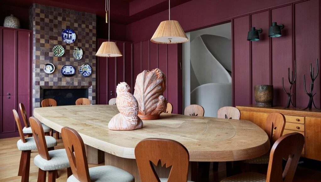
A good coat of paint can fix pretty much anything. Well, maybe not everything—unfortunately it’s not going to solve that leaking faucet—but with a few great painting techniques up your sleeve, you can do a lot.
Case in point: When your client’s luxury condo in that converted factory building seems slightly too spacious to be cozy. As it turns out, the only thing standing between you and a perfectly hygge living room might just be the right paint job. “Cozy isn’t a concept defined by size,” says Anais Blehaut, director of Daab Design in London. “Large spaces can feel superbly warm with the right interior coloring, layers, textures, and tones.”
Read on for more tips from Blehaut and other interior designers about their go-to interior painting techniques.
In large rooms, go light and bright
Although the first instinct might be to bring in a darker tone to make a spacious room feel more inhabitable, it’s not the only solution. “I’m not a huge fan of dark rooms,” interior designer Timothy Brown says. “To make a large room cozier, I generally take a neutral from the color palette of the fabrics and use that on the wall.” Warm whites and pale grays are popular choices, he adds. “I feel just a bit of color on the walls warms things up and ties the room together, almost wrapping the visitor in the experience.”
…or use colors from nature
Blehaut offers a counterpoint to Brown’s love of lightness. In sizable spaces, Blehaut likes to use color to create a cozy ambience. “Colors determine the mood of a large room,” she says. “Tones or colors we associate with nature—soft, muted greens, beiges, charcoals, and woody and golden hues—help create relaxing, warming zones within generous quarters.”
Interior designer Becky Shea adds that it all depends on how much sunlight is present. “The first consideration is always natural light,” she says. “If a space has an abundance, you can really have fun with dramatic tones to create a cozy feel.”
Go monochrome
“I personally like when the ceiling, walls, base, and case are all monochromatic,” Shea says. “This helps to highlight and accentuate nooks and crannies, and gives the room a vibe of subtle elegance.”
Blehaut also opts for a single-tone approach. “Painting a whole room—everything from the walls to skirtings, cornices, fireplaces—in the same color with slight differences in sheens can be very comforting by creating a cocoon of pigments and making tall rooms feel cozy and approachable,” she says.
Use paint to scale soaring ceilings
When you have the kind of ceiling where an errant helium balloon would be hard to retrieve post-party, chances are the room feels a little too lofty.
In a recent renovation of a central London town house with very high ceilings, Blehaut finished the dining room in a dark, matte paint (Farrow & Ball’s Railings), which imbued the space with a sense of refined intimacy. “Some matte whites are fantastic to create openness and scale in rooms with high ceilings,” she adds. “But they need a natural wood trim, a lower-level panel, or an original cornice to create balance and grounding in the room.”
Brown says he prefers to play with tonality to bring a sense of scale. “I will often darken or lighten the wall color to add subtle interest to the ceiling. I take the wall color to the paint desk and ask them to add 50% formula.”
Embrace the hand roll
Designers say that the paint finish is just as important as its color. “I like to specify hand-rolled finish on all painted joinery when they are color-blocked with the room color,” Blehaut says. “A hand-rolled finish is less sterile than a sprayed finish, and the slightly grainy texture absorbs reflections and suggests a natural tactility.”
Take on texture
“My go-to lately is matte plaster,” Brown says. “It’s almost a chalky finish that plays with light reflection on the walls and ceiling. My other preferred finish is using a wash that gives depth and movement to the wall color, regardless of a neutral color or something more bold. It’s a great way to add interest and warmth.”
In many of Becky Shea’s recent projects, limewash has been the star. “The natural earthen mineral pigments of limewash create soft tonal movement that is unique and makes a space feel ultra-cozy,” she says. “I’ve been leaning into this application more so than ever because of the depth and texture it adds to a space. I really love how it looks paired with materials like Belgian linen and bouclés.”
Make it matte
Blehaut is also on board with a matte finish. “Matte paints are incredibly restful for the eye as they minimize the bounce of light around a room in the same way that natural textures like timber, wool, and linens absorb light,” she says. “A matte finish evens a surface, creating a muted block effect that helps the brain relax and escape the physical boundaries of the room.”


