Though minimalism still has a devout following of designers, maximalism—with its bold patterns, supple textures, and eye-catching motifs—is thriving in today’s interiors. A high-impact, can’t-miss-it hue might be the pièce de résistance of any bold room, but choosing the right paint colors for your space is often easier said than done. On the one hand, a maximalist shade should make a statement—a visual exclamation point if you will. But at the same time, selecting a color that’s too bright can upstage the rest of your decor, throwing your room’s vibe out of whack in the process.
And as if mastering that balance between eye-catching and cohesive wasn’t challenging enough, you’ll also need to pay attention to the room’s lighting conditions as well as your preferred undertones. So, the big question: Where start your search? AD PRO chatted with nine designers about their favorite statement paint colors—from malachite green to sunny yellow, the tones below are equal parts bold and beautiful.
FTT-012 by Mylands
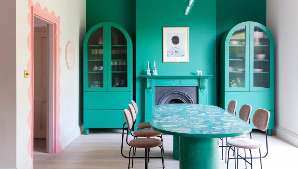
“This color goes beyond trends and remains timeless. It’s a jolt of nature, evoking rich forests, deep seas, and precious stones. This interior, which is featured in our book, Making Living Lovely: Free Your Home With Creative Design (Thames and Hudson), features Mylands FTT-012. Green is calming and has a powerful connection to the outdoors, something that is so important for our well-being. As it does in nature, this color also works as a wonderful companion for our favorite pinks, sky blues, lilacs, and earth tones. In this photo, the color reveals itself as you turn the corner into the space and notice the wall of greenery in the garden beyond the double doors. A lovely surprise in such a neutral space.” —Jordan Cluroe and Russell Whitehead, 2LG Studio
Sunshine on the Bay 347 by Benjamin Moore
“The colors of this bungalow are black, white, and yellow. I think many people shy away from black and yellow for fear that the combination will feel too much like a bumble bee, but when you add in plenty of white and natural materials like rattan, it is a favorite mix for me.” —Celerie Kemble, Kemble Interiors
Milano by Studio London Co.
“I love a dark, mossy green! I painted my living room in the shade Milano, which is a color in my upcoming Studio London Co. paint line that is debuting in late summer 2022. The shade reminds me of Italy—rich and multifaceted!” —Travis London, Studio London
French Horn 195 by Benjamin Moore
“We love using a strong yellow in kitchens, it feels bold and dramatic but also quintessentially kitchen-y. Benjamin Moore French Horn 195 (shown here) and Benjamin Moore Showtime 293 are two favorites.” —Frances Merrill, Reath Design
Ibis Isle Blue by Fine Paints of Europe
“My decorating is often inspired by art and this color reminded me of Yves Klein blue. I love to use it in studies or libraries as blue represents wisdom and knowledge. It’s electric enough that it inspires, but also reminds me of the sea connecting one to nature.” —Sasha Bikoff
Big Country Blue 2066-30 by Benjamin Moore
“I’m always on the lookout for bold, yet calming blues. Big Country Blue is beautifully saturated and makes defining your space a breeze.” —Rayman Boozer, Apartment 48
Sunburst 2023-40 by Benjamin Moore
“This color is not for the faint of heart but, simply put, this yellow makes one’s heart sing. It’s very positive and optimistic. Sunburst is graphic and not subtle. Instead, this yellow is all about energy.” —Ghislaine Viñas
Softened Violet 1420 by Benjamin Moore
“When working on the design for this room, I wanted to really capture a color that sets a playful tone for bold art and fabrics, but doesn’t look childish. I looked at many colors and honestly kind of questioned if I was pushing it too much with Benjamin Moore’s Softened Violet, but my instinct kept going back to it. It feels fresh, happy, and soothing all at once. When you walk in the room, you instantly feel the happy, artsy energy!” —Lisa Gilmore
Babouche No. 223 by Farrow & Ball
“I love painting a door or an entire room yellow. It’s a cheap and cheerful way to make your home more vibrant and fun. I’ve always gravitated towards yellow. It brings me so much joy. I have some fond memories of yellow growing up, like choosing Lisa Frank folders to picking out yellow curtains for my room in high school. Even though yellow is associated with my youth, it can still be a very sophisticated color. Farrow & Ball’s Babouche definitely offers that luxurious effect.” —Dabito


